Case Study
'GalleryPal':
Design Sprint Challenge
Problem: Apps to assist users inside an art exhibition can distract from the main experience of viewing art.
Solution: An app that shows customized fun facts on a phone’s lock screen or smart watch, or by audio.
Tools: Figma, Microsoft Witeboard, Google Jamboard
Date: October 20 – OCtober 25, 2020
Deliverable: Prototype
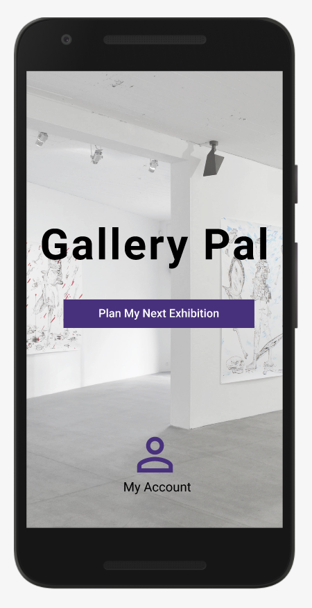
I designed ‘GalleryPal’ as part of a 5-day Google Venture Design Sprint where I was challenged to create and test an app that improves a user’s experience viewing art in a museum or gallery. This mobile app retrieves personalized fun facts to send to a user during their trip. They can receive these fun facts as lock-screen or on-screen notifications on their phone or smart watch, or by audio. This way they are not distracted by their phone and can focus on the art. After creating a low-fidelity prototype, I tested my designs with 10 users. When the sprint was over, I then created high-fidelity screens for this case study.
Day 1
Understand and Map
Persona
I was presented with responses from 5 interview participants, along with a persona already developed based on the information gathered from these interviews. This persona, named Angela, is a 25 year old Junior Art Director working in New York City:

The persona I’m designing for is an individual with a high level of interest in art exhibitions who visits them more often than the average person. They have decided ahead of time that they are visiting an art exhibition and want to be prepared; they are actively looking to improve their experiences as compared to past exhibitions; they regularly visit art exhibitions and seem to know what they like in art, and what to expect in an exhibition, rather than a tourist or one-time visitor. Therefore, I can design something for them to start using before their visit rather than in the moment. I can design something for them to use over and over again that can learn from their feedback and behavior.
Ideation
My idea is to create an app that sends personalized fun facts to users during their visit to spark interest and curiosity in the artworks they’re viewing. The user informs the app about their interests before their visit. During their visit, they receive short, personalized fun facts as notifications they can read without unlocking their phone. It also show notifications on a smart watch, or read the notifications aloud. After their visit for the app to improve for the next exhibition, users can review the fun facts they received and tell the app whether or not to send similar facts in the future.
These user stories show that most of the interaction with the app happens before and after a user’s visit:

Day 2
Sketches
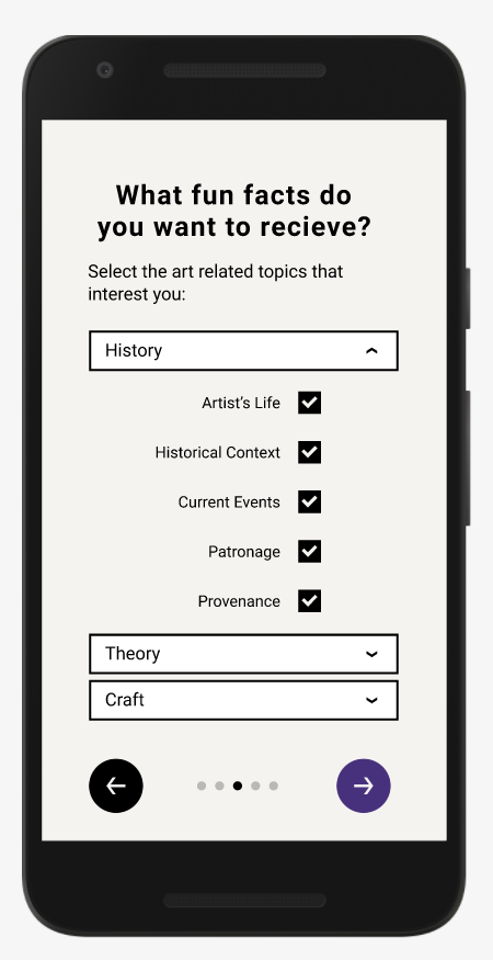
For day two, I need to scketch the most crucial screen in the app. I picked to sketch the screen when users tell the app what interests them in art since this determines the types of fun facts they will receive during their visit. I have not decided exactly how this will be engineered, but I imagine the software will take the user’s input and match it to API data found online about the exhibition as well as the artworks and artists included in the exhibition. Museums and galleries usually post a lot of information on their websites and social media pages. There is also other information on the web about the art or artist that may not be about the specific exhibition. This software could gather a wide range of facts related to an exhibition.
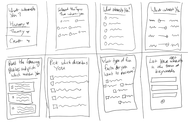
I had to design a screen where the user can describe their interests in art, or describe the type of art viewer they are, in the form of keywords that a computer can process. I came up with eight different types of forms where the user can input these keywords.
I chose to continue with the design on the first screen where keywords are grouped into three categories: history, theory, and craft. Before this screen, the user tells the app which art exhibition they are going to. After this screen, they can choose to connect other accounts to tell the app more about them. Alternatively, they can skip this step and choose to input more personal data in another form.

Day 3
Storyboard
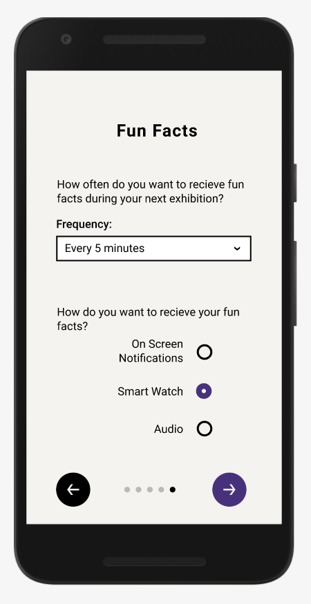
The storyboard for GalleryPal includes sketches of all the screens a user will interact with when accomplishing the main goals in the MVP: onboarding a new user and reviewing a past exhibition. After onboarding and before reviewing, the user receives fun facts at their scheduled exhibition. However, the user does not receive these fun facts through the app interface. Instead, they will come as on-screen notifications that inherit the interface of the user’s smartphone or smartwatch.
Path: Onboarding
The first row of the storyboard shows the onboarding path. In this path, the user goes through four screens to plan their first exhibition, and one more screen to confirm those details.
The screens would look very different the second time the app is used and every time after that. The onboarding path fills the user’s account with the same details, saving them as preferences. When a user goes to plan their second exhibition, their preferences for the first exhibition will already be there (except for the location and time). This way, they don’t have to reconnect accounts or select interests again. However, they could change details for each exhibition. For example, in one exhibition, a user might only want history-related facts, but in another exhibition they might specifically be interested in the craft.

Path: Review My Exhibitions (My Account)
The second row of the storyboard shows the path a user takes to review a past exhibition. From the home page, they click on the account icon to access their account. This page has options to review a user’s art interests, upcoming exhibitions they have planned, their history of past exhibitions, and their connected social accounts. When a user clicks on “past exhibitions,” the first time they’re using the app when there is only one past exhibition, they’ll see a list of the fun facts they received. They can upvote those fun facts here. Any other time after the first time using the app, they will see a list of their past exhibitions to select from.
Day 4
Prototype
Day four was spent building a low-fidelity prototype in Figma to illustrate the onboarding process. Since this process is essentially a form on multiple screens, the process of entering each piece of input has been abbreviated:
Day 5
Test
Test Plan
With this app, it made the most sense to test the onboarding process which is why I decided to build this prototype the day before. I mainly wanted to get feedback on the onboarding questions being asked to the user and see if the onboarding process could give them an overall good impression of the app.
I asked my participants what they would expect from the app during and after an exhibition based on this first impression. Do they expect to get interesting fun facts? Do they trust it will improve their experience? A positive response would be if a participant is curious or excited to see the facts they get; A negative response would be if they seem reluctant, or decided not to use the app during their visit.
I was also able to test some of the usability features in the onboarding process. Although it is tough to test UI interactions on a form in a prototype, I could still test other things about the form. I asked if the process had too many screens or took too long to complete, and if the questions made sense the way they were asked.
I tested the prototype on 5 of my friends over video chat. These are all people who I know love to go to all types of museums, including art museums. I shared my screen and had the participants tell me where I should click on their behalf.
Test Results
One participant was confused by the first screen, “Where is your next art exhibition?” She asked if the app was only for temporary exhibitions and not for displays permanent collections. I realized the term ‘exhibition’ is problematic because not every art exhibition is called an ‘exhibition.’ For example, they could be called ‘shows’ or ‘displays.’ Plus, some institutions have temporary or rotating displays alongside permanent displays.
To solve this problem, I added an inactive input on the “select location” screen for a user to choose a specific exhibition inside of an institution. In the future, I would also perform more testing using different language to see if the term ‘exhibition’ works best.
Next Steps
This Google Ventures Design Sprint Challenge showed me that my app idea is promising but there’s a lot of work to be done. My test participants were intrigued by the prototype and are very curious to hear the fun facts they would receive. The next step would be to work with engineers to figure out the best way to craft these personalized fun facts for each user. One test participant, who is also a software engineer, mentioned that it might be worthwhile to combine API data with information manually inputed by exhibition tour guides, docents, or curators themselves.