Case Study
Arts Raiser
Problem: Artists are underpaid, and their products are often able to be consumed for free
Solution: A simple platform that combines a gift registry with a way for artists to collect tips
Tools: Figma, Miro, Balsamiq, Google Forms, Google Jamboard
Date: April 2020 – August 2020
Deliverable: High-Fidelity Prototype
I created Arts Raiser as a capstone project in my user experience design bootcamp with support from my mentor. I decided to execute an idea I had thought of during my time employed at various arts institutions. Working during the Covid-19 pandemic, I conducted interviews over videochat and tested sketches and prototypes by screen-share.
Arts Raiser is a website application where artists can quickly and easily raise funds and receive other types of support from their fans. Artists list links to their payment service accounts to receive tips, and to any other website or profile that they want to direct their fans.
Research
Background
There are two levels of consumption that occur with one artwork: the first is when this artwork is acquired by a buyer or patron; and the second is when an audience views or experiences this artwork. It’s the second level of consumption that I want to focus on. We live in an ‘experience economy,’ which is a term coined in 1998 by Harvard economists to describe a level of economic value that is beyond goods and services where consumers primarily seek out and pay for experiences. An example of this is the pay-per-view business model such as buying a ticket to visit an art exhibition. However, many artists with artworks prevalent around the world are not renumerated for that second level of consumption.
Even if an artwork is paid for and an artist is compensated, the life of an artwork extends far past that initial transaction. I believe that artists should financially capitalize on the prevalence of their images around the world in every form. Artists often beautify our world for free, and in an Experience Economy, people should show their appreciation by paying them just like any other worker.
The main questions come to: “How can artists get paid by people who have seen their art? And, How can artists monetize the popularity, reach, and exposure of their art around the world?”
Secondary Research
I researched different creative ways artists have connected with fans to earn money to gauge the scope of possibilities. There’s a lot of platforms and services where money is exchanged, so I wanted to find as much about these examples as I could.
I started with an analysis of Patreon because it can offer insight on the success of a membership-based business model. With Patreon, fans decide how much money they want to pay a creator on a monthly basis. Usually, creators give exclusive content to their patrons in exchange for their monthly pledges. However, the platform can be used by creators without content (gifts, rather than sales).
- Artists Making a Living With Patreon – October 2018
https://www.format.com/magazine/features/art/artists-making-living-patreon
I also researched blockchain technology and art. Developers are looking for ways to monitor when digital images are reproduced and distributed online. Although the intent is to prevent copyright infringement, I could learn from how they’re approaching the problem of art’s circulation online.
- The New Art Economy Is Here, And Artists Are Reaping The Benefits – July 2018
I searched different keyword combinations in Google, like ‘support’ + ‘artist,’ to see what else I could find. I stumbled upon this news article for a virtual tip jar to support musicians usable to perform live during the Coronavirus pandemic. Although it is for musicians, I believe the concept can fit visual artists.
- RI Musician’s Virtual Tip Jar: Help Support Local Artists – April 2020
https://whatsupnewp.com/2020/04/ri-musicians-virtual-tip-jar-help-support-local-artists/
Interviews
I interviewed 5 working artists in my network to ask them about the troubles they face earning money with their art, and how well different solutions work for them. I also specifically wanted to know about earning money from fans without selling an artwork, such as if they get tips or gifts.
To recruit qualified participants, I sent a screener I made on Google Forms to artists I know personally and posted it to art Facebook groups. I primarily needed to make sure my participants were ‘working artists,’ rather than ‘hobby artists,’ in that they are actively trying to earn money with their art.
Highlights:
- My first participant, E.S., is a photographer with 6 years experience exhibiting her art to the public. I noted that before selling a commission, she needs to know if the print will be in public display. If so, she would mark up the price by 15-25%.
- My second participant, J.G., is a mural artist and painter with over 30 years of professional experience. He supports himself financially with his art and other services he offers, such as curating art shows in local restaurants. When building his career, he highlighted what he calls the ‘friends and family’ period. This is when an artist is starting their professional career and most comissions are coming from people they know personally. This period can be prolific but usually short-lived.
- My third participant, J.S., is a graphic designer and digital artists with 4 years of professional experience exhibiting and working for commissions. He loves to draw and wishes he could make a living off of original drawings alone. However, he realizes it’s more practical to make items that sell, and as a graphic designer he can easily do this. He’s creating a website and establishing stores on Society6 and Etsy to sell products like stickers, buttons, clothing, and more.
- My fourth participant, N.A., is a digital artist, printmaker, and illustrator with a full-time job as a web designer. Similar to J.s., She ideally wants to make a living off of only original screenprints and illustrations. Although she is still doing a lot of this work, the commissions are not enough to form a career. Now she uses similar skills as a web designer.
- My fifth participant, J.F., is a mural and graffiti artist with decades of experience. He is incredibly selfless and often participates in volunteer arts programs. He knows images are used without persmission all the time, so he doesn’t try to stop it.
Empathy Maps
I collected key points and statements that the artists made during the interviews that reflect their perspective on earning money as an artist. Similar statements were grouped together to create two empathy maps for two different types of users.
The artists in the “Career-Development” type often make artworks without being fully compensated as a way to gain exposure. I noted that many of these artists would sacrifice pay for publicity, but they still aspire for a stable career as an artist.
The artists in the “Community-Advocate” type primarily want to raise money for other causes. They are passionate about something, and they want to use their art and themselves to draw attention to it.
Career-Development Type

Community-Advocate Type

For both types of artists, I also noted that they don’t want to use more marketing platforms. All of my interview participants mentioned how they hate spending time on marketing.
Personas
To create the final personas, I gave identities to the two types of artists that I kept in mind as I designed Arts Raiser. Jo represents the ‘Career-Development Type’ who wants to raise support for themselves. She gets paid to paint murals, but currently not enough to support herself full-time. Nick represents the ‘Community-Advocate Type’ who wants to raise support for other causes. He supports himself with his art and is a relatively well-known influencer. He wants to use his popularity to raise money for causes he cares about.
Career-Development Type: Jo
- Job titles and major responsibilities: regularly gets hired to paint murals and still works a full-time job
- Education: B.S. in Accounting
- Ethnicity: White
- Family status: Single mother with two kids
- Needs & problems: Since she’s painted murals in the past, she has an established network and understands the market. She knows she needs to offer a competitive bid to get chosen to paint a mural, but wishes she could make more money to support herself. She is tied to her job for steady income and benefits, but wants to only focus on painting and family.
- Motivations & goals: Quit full-time job; further develop career as mural artist
- Physical, social, and technological environment: Doesn’t like technology or social media. Barely uses the computer, and her kids need to help her with her smartphone pretty often. A friend made her a website in the past, but it hasn’t been maintained. Streams TV often.

Community-Advocate Type: Nick
- Job titles and major responsibilities: Established artist part of major Chicago art gallery
- Education: MFA from elite art school
- Ethnicity: Black
- Family status: Married with kids
- Needs & problems: Now that he has his art career in a good place, he wants to raise money for community art projects that he’s passionate about, especially in African-American communities. He has started scholarship programs at HBCUs
- Motivations & goals: Use his fame and popularity as an artist to draw attention to problems in the Black community and raise money for community development
- Physical, social, and technological environment: Gallery manages his website, but he is very active on Instagram. Uses smart phone and computer as needed for business, but generally dislikes technology.

Design
Ideation
to start thinking of viable ideas to solve the problem of artists being underpaid, I took major insights from my research and rewrote them in the form of “How might we…” questions. Rephrasing the issue as a question helped me generate ideas because I had to think of different ways to answer the questions.
Insight #1
- How might we maximize compensation/remuneration from these people?
- How might we monetize or capitalize on their support?
My solution for this is to create a wishlist for artists. A wishlist is a list of gifts that, usually, hosts send to their guests before a significant party or event such as a graduation or wedding. Utilizing my two personas: artists who want to raise support for themselves can list on their page their Patreon, Instagram, Etsy, Society6, Deviant Art, and other pages that promote themselves; artists who want to direct their fans support to other causes can list on their page Kickstarter or GoFundMe campaigns or charity and nonprofit fundraisers associated with them.
Insight #2
- How might we pay artists for past investments?
- How might we compensate artists for undervalued work they did in the past?
My solution is for artists to collect tips. Tips are somes of money that customers or patrons pay to workers who they understand to be undercompensated. For some jobs, like waitressing, coat checking, and valet parking, it’s expected for customers to pay these workers an extra sum to show appreciation for their good work and ackowledge that their industry, or their employer, doesn’t adequetly pay them. In an experience economy, I believe people should have the same attitude towards artists. People view and experience artworks that artists put work into without paying beforehand, so people should be able to compensate that artist afterwards.
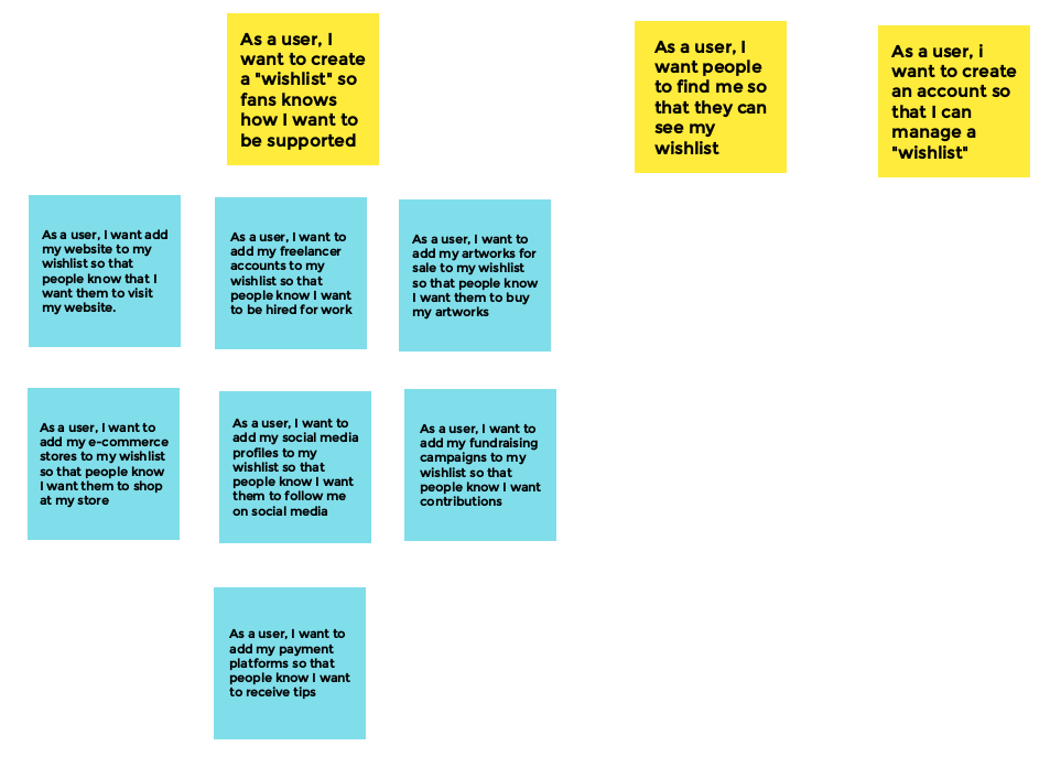
User Stories
I rewrote the tasks that artists want to accomplish with Arts Raiser in the form of user stories in order to start to see the path users would take in the app.
I started with the stories in the blue post-in notes below thinking about all the ways that artists want to be supported online. Then I grouped those stories into a larger “wishlist” story in the yellow post-it note above. The three yellow post-it notes show the main stories I focused on creating as I developed more detailed user flows:
User Flow
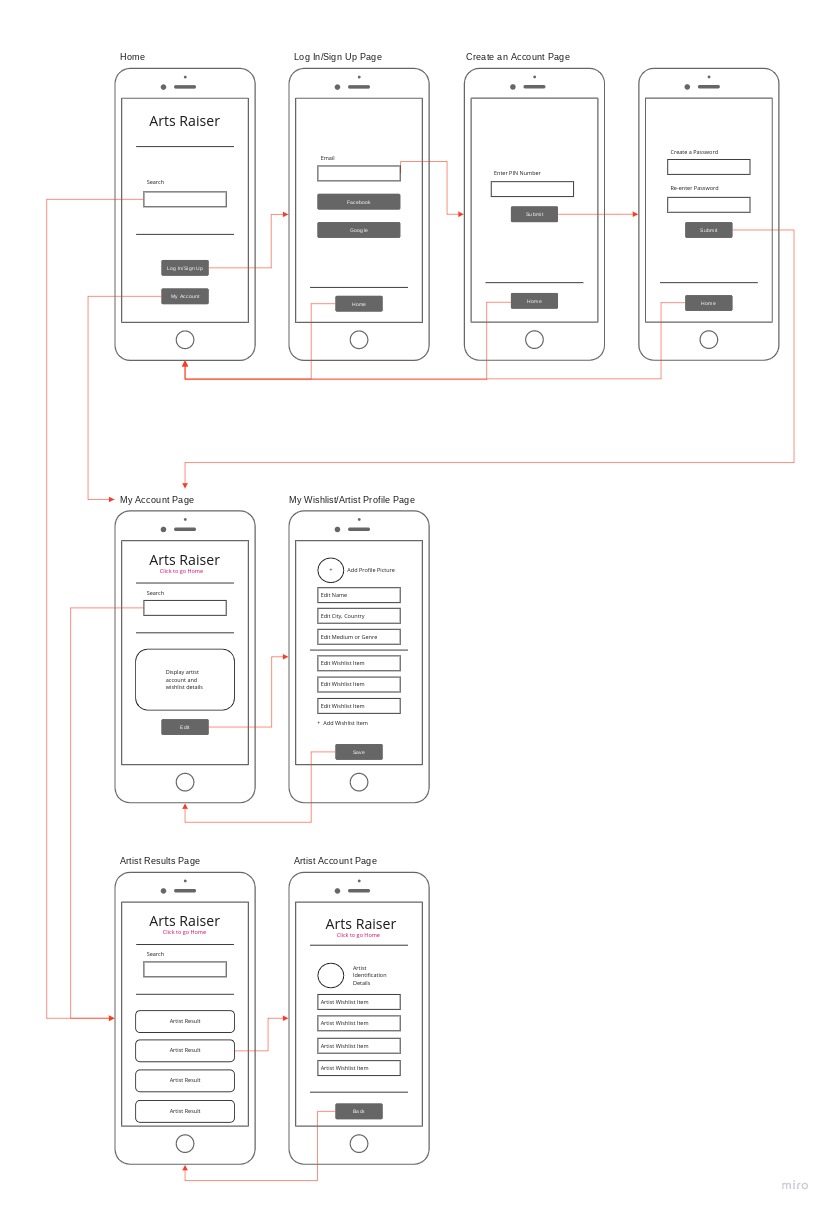
I created a user flow diagram in Miro to illustrate how the user stories will be realized in the app. Each story is broken down into three elements: pages, actions taken on a page, and inputs necessary for an action. Then I connected these elements to create the path that a user would follow to complete a task. This diagram helped me make sure that all steps in a task are accounted for so I could start sketching the screens that are apart of each user flow. Additionally, each user flow section became “Red Routes” in my wireframes.
In the future, this diagram will also be helpful when adding new functions to the app by expanding existing flows.

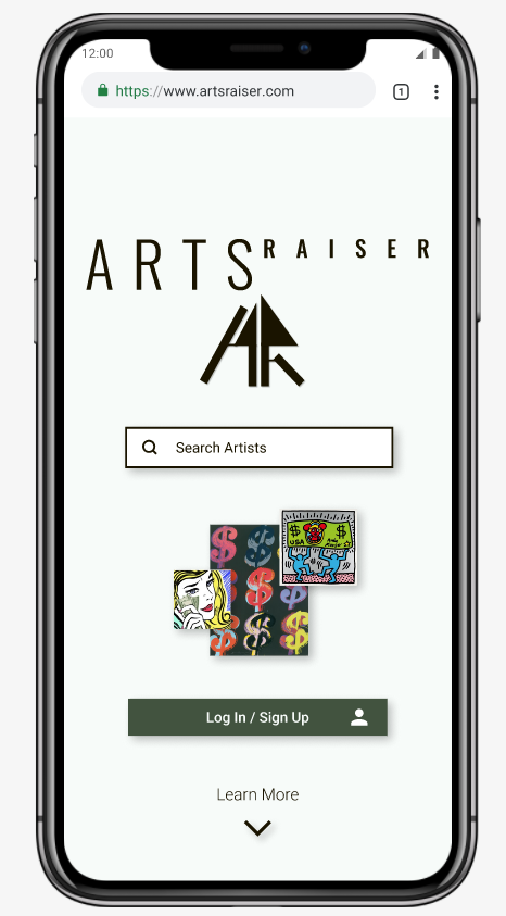
Starting at the homepage, there are three sections a user can flow into: support an artist section, log in/sign up section, and the account and wishlist section.
Section: Support an Artist
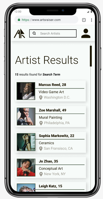
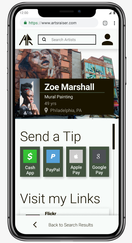
This section on the top right is like most search engines. First, enter a search term. Then, click on the desired artist in the results list. After, view this artist’s page. Last, click on a wishlist item, which will open a link in a new tab. In the future, this section can be expanded to include other features, such as filtering or image search.
Section: Log In / Sign Up
In the section on the top left, starting from the homepage, a user can log in or sign up by using their email or their Google or Facebook account. In the future, more security measures could be added to this section to prevent users from creating multiple accounts, or impersonating someone else.
Section: My Account and Wishlist
This section on the bottom is for users to manage their identification details and wishlist items. Currently, the only users I am designing for are artists themselves, but in the future, this could change. There could be other useful reasons for people who aren’t artists to have an Arts Raiser account, such as bookmarking artists or wishlist items. There are many other funtions I could add to this section.
Sketches
I quickly make sketches in Miro to illustrate my idea for Art’s Raiser’s interface.
The first line of my sketches show the screens to log in or sign up for an account. The second line shows the screens to edit a wishlist once inside an Arts Raiser account. The last line shows the path to support an artist, including the artist search results screen and the individual artist profile screen:
Wireframes
In order to build a Minimum Viable Product (MVP) or prototype for the purpose of user testing, I first designed the app’s three main “red routes.” These are the screens necessary for a user to interact with to accomplish the main goal of the app. They correspond to the three sections of user flows. There is a lot of potential functionality that I could add to Arts Raiser.
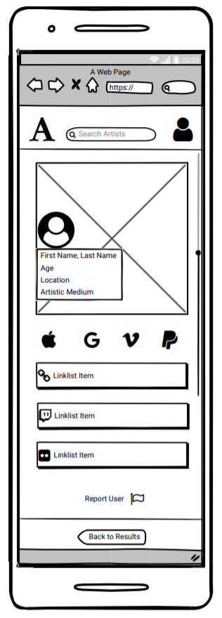
Red Route: Support an Artist
The screens in the ‘support an artist’ route include the home screen, the search results screen, and an individual artist’s page:


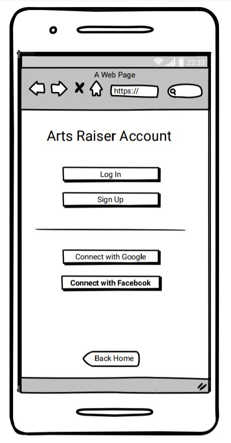
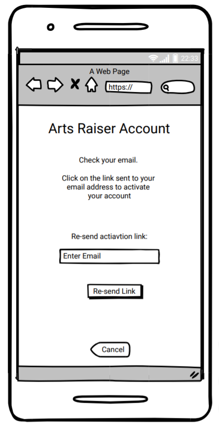
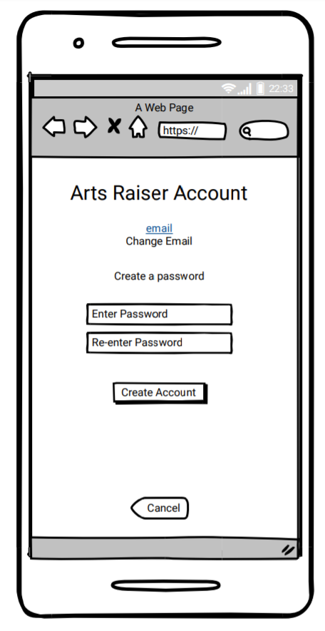
Red Route: Log In / Sign Up
This red route shows the screens a user sees if they decide to sign up for an Arts Raiser account by using their email address. Creating an account is a simple email verificaiton process with a link sent to a user’s email:

Red Route: Edit My Wishlist/Linklist
All the items on an artists page are added by links. Artists smply add the URL of the item they want their fans to find. For example, instead of connecting a user’s Arts Raiser account to their CashApp profile, that user will add a link to their Art’s Raiser page to direct visitors to their CashApp profile.
At this point I also decided to change the term Wishlist to Linklist. I was concerned that people will think that a wishlist item is something that the artist wants someone to buy for them. With a wedding or baby registry, the wishlist is a list of items that the host wants the guests to gift to them. Since I don’t use the word ‘registry’ on the app, I didn’t think it was still appropriate to use the word ‘wishlist.’
In this red route, the user clicks on the ‘Edit My Links’ button to view their whole Linklist; then they click on a Linklist item to edit that link.
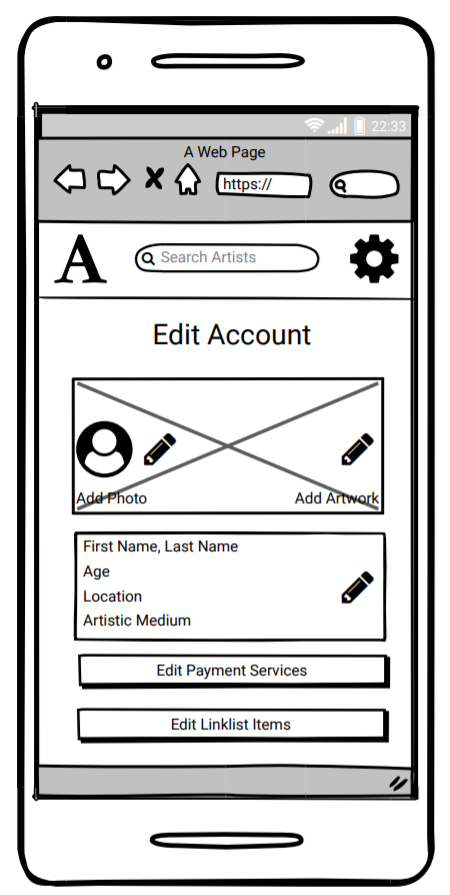
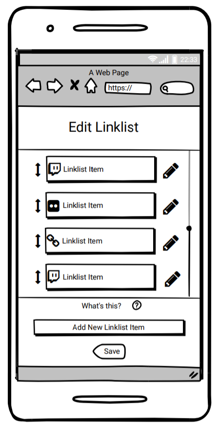

Since items are all added by links, the app can easily support links to websites or payment services that are not in the Arts Raiser app at that moment. This is ideal for artists with their own website, and to accomodate new or less popular websites.
 8")
Style Guide
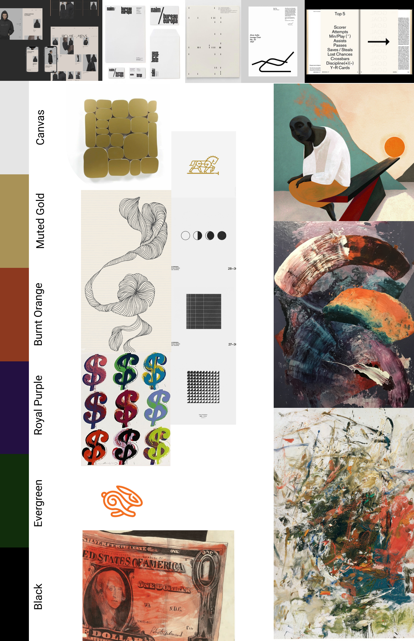
Mood Board
I put together a board filled with images to use as a visual guide as I designed the interface. I imagined an interface that was mainly black-and-white so that artworks and call-to-action buttons could stand out. The top row shows black-and-white interface suggestions, and the rest of the board shows the color palette I created to pair with them. Ultimately, I only used one accent color: Muted Gold.
Icons
I created a set of icons for popular websites that artists use. These will be on the Artist Profile pages:

Artwork
I also collected a set of self portraits of various styles to use around the app. They represent Arts Raiser’s target users:
")
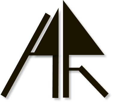
Logo
The logo was inspired by modern art. I designed to look like the initals, AR, in the shape of an arrow pointing up since the app is focused on “raising” the arts through funding and other support. I tried to be minimal and only use one color so that the logo can be used in all sizes and in various places:
Test
Prototype
To conduct usability tests, I first built a prototype that includes all three red routes. Working with Figma, I created high-fidelity mockups of all the screens as well as build a clickable prototype and add animations.
Red Route: Search for an Artist
I built in the prototype the path to find a sample artist I created named Zoe Marshall, and view her Flickr Linklist item and visit her Paypal page to send a tip:
Red Route: Log In / Sign Up
Starting from the homepage, I built the path to sign in to a sample Arts Raiser account:
Red Route: Edit My Linklist
Starting from the sample account for Jo Zhao, I built the path to add her Flickr page to her Linklist:
Usability Tests
After setting up paths on the prototype, I had 10 participants go through these paths in structured tasks. Over video conferece, I shared my screen with my participants and had them verbally direct me through each task since they couldn’t have direct control of the prototype. This ended up being very useful to me because it was easier for them to talk about their actions. In the first round, 5 participants tested the app by trying to accomplish 4 tasks. Then I corrected some flaws I had in the testing process to improve my test results moving forward. In the second round, 5 different participants tested the app by trying to accomplish the same 4 tasks.
Tasks:
- Find Zoe Marshall’s Instagram page
- Log in, then log out
- Add CashApp to your Artist Profile
- Add an artwork to your Artist Profile
Redesign
All of the participants were able to accomplish the tasks, but some of them struggled or hesistated with certain things. I redesigned Arts Raiser to make tasks easier to complete, as well as address other issues.
Color and Artwork
User testing suggested that I add more signals on the homepage that describe what the app does. Although users could scroll down to learn more, this isn’t a primary action and my participants didn’t do it. To fix this, I added artworks of money and dollar bills on the homepage above-the-fold.
I also changed the primary color to try to signal that Arts Raiser is for fundraising. The gold color I was aiming for actually looked like mustard I changed it to green which is similar to Kickstarter and GoFundMe.
Task Completion
At first, I thought it would be simpler for input to automatically save when a user goes to edit their details on their artist profile page and Linklist. The green ‘save’ button would instantly turn gray after input is entered to show that the task is complete. But not only did this confuse many of my test participants, it also wasn’t as convenient as I thought it would be. I updated this so that a user has to click on the ‘save’ button to know the task is complete.
For example, when a user uploads a sample artwork, the ‘save’ button turns gray only after it is clicked:
Language
User Testing showed me that I had to make the language on a few key pages more consistent. The primary button should lead to the page with the exact same title so that a user knows what to expect when they click on that button. For example, when a user wants to add a payment service, the ‘Add Payment Service” button leads to the ‘Add Payment Service’ page, and the ‘Edit Payment Service’ button leads to the ‘Edit Payment Service’ page: